
A Guide to Data Visualizations at BLS
Data visualizations display quantitative information visually. Visualizations include charts, maps, infographics, and other types of displays. Readers often understand statistics more easily and quickly when they are presented visually.
Good data visualizations achieve the following objectives:
- Present complex data simply
- Work well with general and expert audiences
- Help readers see important points quickly
- Help us communicate more effectively than we can with pages of text and detailed tables
- Stimulate curiosity
Most BLS publications use data visualizations, and you can find plenty of good examples in each of them.
There are many different types of data visualizations, and new ones are created all the time. There are also many good guides you can find through a web search about which data visualizations are best for particular types of data. This guide isn't intended to be exhaustive, but here are brief explanations and examples of the most common data visualizations we use at BLS.
Table of Contents
- Line Charts
- Two-Scale charts
- Area Charts
- Column sharts (also called vertical bar charts)
- Stacked column charts (also called stacked vertical bar charts)
- Horizontal bar charts
- Scatter plots
- Bubble charts
- Pie charts
- Maps
- Chart-making tools
- Keys for effective data visualizations
- Guidelines for specific parts of data visualizations
- Some Do's and Don'ts in data visualizations
- Static versus Interactive and Animated Data Visualizations
- Where to get help
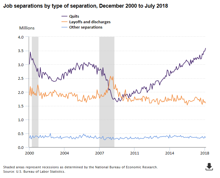
Line Charts
Line charts are used to show data relative to a continuous variable, usually time. We use line charts at BLS to show historical series or projections. Line charts make it easy for the reader to identify trends.
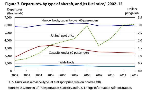
Two-scale Charts
A two-scale line chart or combination line-column chart allows you to plot data using two y-axes and a shared x-axis. These charts are often used to show a correlation, or lack of correlation, between data sets that have different units of measurement. Be careful when using two-scale charts because readers may find it difficult to determine which dataset corresponds with each y-axis. Two-scale charts that have different y-axes also can be misleading if the scales are manipulated in a way to make it appear data series are correlated when they really are not.
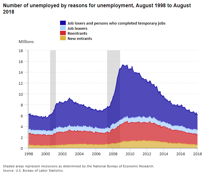
Area Charts
An area chart is similar to a line chart, but the space between the x-axis and the line is filled with a color or pattern. It is useful for showing part-to-whole relationships, such as the number of unemployed people by reason for unemployment. Area charts help you analyze both overall and individual trends.
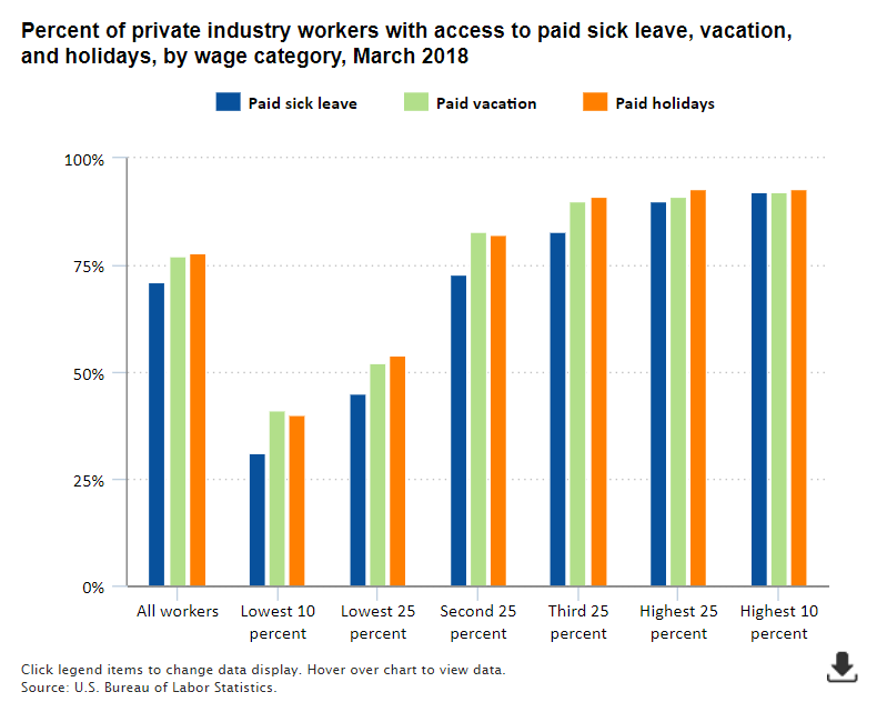
Column charts (also called vertical bar charts)
Column charts are best for comparing data grouped by discrete categories. Column charts are best when you don't have too many groups (fewer than 8 is usually good).
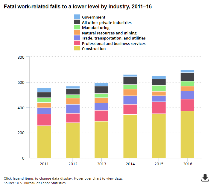
Stacked column charts (also called stacked vertical bar charts)
Stacked column charts are a great choice if you not only want to show the size of a group relative to other groups, but also illustrate the parts that make up the whole group.
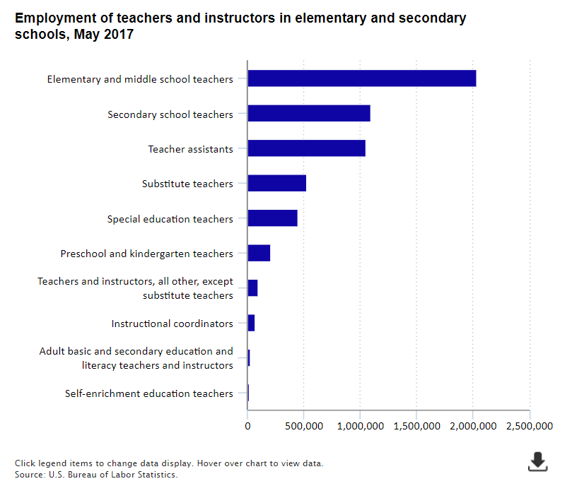
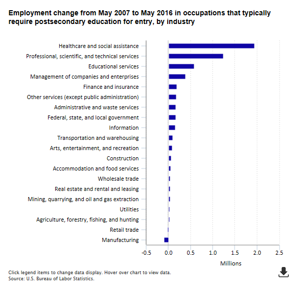
Horizontal bar charts
A horizontal bar chart is similar to a vertical bar chart but is typically used when the number of categories is large (greater than 8 or so) or you have long labels that you would like to display for each category. It's much easier to read the labels when they are displayed in proper orientation.
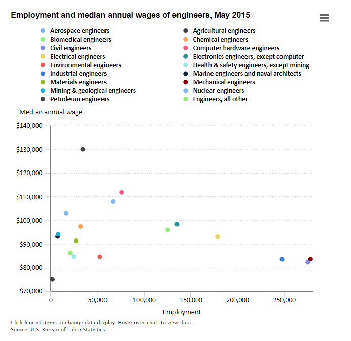
Scatter plots
A scatter plot chart shows the relationship between two different variables. If the data points form a band extending from lower left to upper right, there is probably a positive correlation between the two variables. If the band runs from upper left to lower right, a negative correlation is probable. If it is hard to see a pattern, there is probably no correlation.
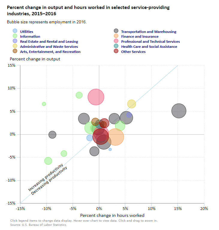
Bubble charts
A bubble chart is similar to a scatter plot, but the size of the bubble represents a third variable.
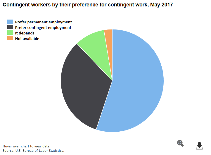
Pie charts
Pie charts are easy to read, and nearly all readers understand them, so that makes them an appealing choice to show readers the parts of a whole. One disadvantage of pie charts is that they have no scale to make it easy for readers to determine values the way they can from the vertical axis on a column chart or line chart. Nevertheless, pie charts can be useful for showing approximate values. If you have more than four or five categories, it's usually better not to use a pie chart; a column or bar chart may be more appropriate. It's a good practice to order the pieces of the pie according to size and always make sure the total of all the pieces adds up to 100 percent.
Maps
Maps show geographic relationships or variation in data. At BLS we commonly use maps to show data for states, metro areas, and counties.
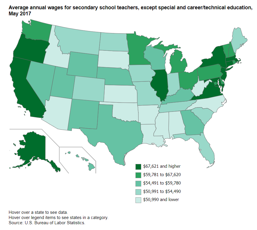
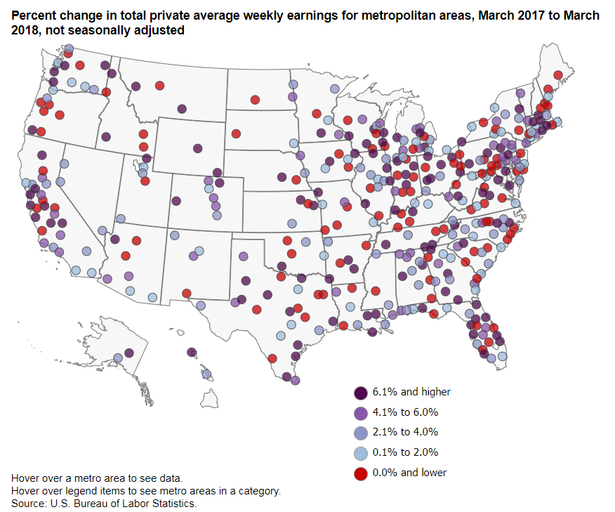
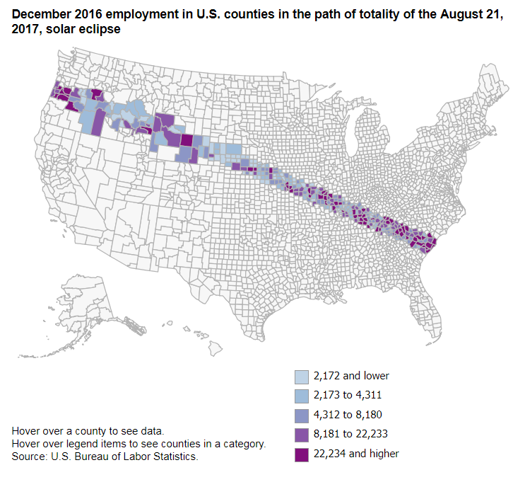
Chart-making tools
There are many good software tools for creating data visualizations. This guide does not focus on how to use any specific software but instead presents good practices for making effective visualizations.
These guidelines apply to static, interactive, or animated data visualizations. In some places, we discuss how interactivity or animation can improve a data visualization.
Keys for effective data visualizations
Know your audience. Simpler data visualizations are
usually
better for any audience, but an expert audience may understand more
complex
visualizations. As with any type of communication, know your
audience.
Make data visualizations a central feature of your storytelling. You may find it helpful to create your data visualizations before you begin writing, to help you see the interesting data patterns you want to write about.
Choose the right data visualization to help you tell your story. Would a map explain a point more clearly than a chart? Would a stacked column chart be better than a pie chart? Not sure how to choose? The staff in the Office of Publications can help.
A data visualization must be able to stand alone. Data visualizations often complement the text, but a visualization also must be understandable apart from the text that accompanies it.
Guidelines for specific parts of data visualizations
Chart and Map Titles
- Each graphic should have a title that briefly describes the data in the chart or map.
- The title should be at the top of the graphic and no more than two lines long.
- Graphics may have titles that are purely descriptive, or they may present analytical results. Compare these two examples:
- Descriptive title: "Selected percentiles of usual weekly earnings of full-time wage and salary workers age 16 and older, in 2017 dollars, 1979"
- Analytical title: "Real earnings increased for the highest earners since 1979 but are unchanged for the lowest earners"
Most BLS publications use descriptive titles, but there is nothing wrong with using analytical titles. As always, the choice about which style to use depends on the audience. The editors in the Office of Publications can help you decide. The BLS publication Spotlight on Statistics uses both styles together. The chart titles typically use the descriptive style, but each slide in Spotlight also includes a headline that is analytical.
Legends
- Legends should appear in the same order and direction as the data. This arrangement sometimes is not possible for line charts in which the lines cross one another. The arrangement is helpful for bar and column charts and line charts in which the lines do not cross. See the examples below.
Gridlines
- Use gridlines to help guide the reader's eye, but don't make them too intrusive. You want readers to focus on the data, not the gridlines.
Notes and Sources
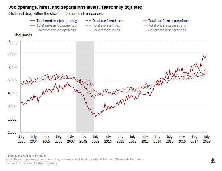
- Notes, located at the bottom of the chart, should be brief and should provide information to help the reader understand how the interactive features work or what recession shading or similar features mean.
- Avoid including detailed technical explanations about the data in a chart. Such explanations often distract readers from the main point of the chart. Find another place in the publication to explain technical information.
- A typical note on a BLS chart might say, "Shaded areas represent recessions as determined by the National Bureau of Economic Research. Click legend items to change data display. Hover over chart to view data."
- All data visualizations should include a source note that credits the data to BLS or another source. The source note is the last item in the graphic. If the visualization shows BLS data, always show "Source: U.S. Bureau of Labor Statistics." Avoid citing the specific BLS program, however, because doing so clutters the visualization and does not provide information that is meaningful to most readers.
Axis Titles
- Axis titles may not be necessary if the chart title is clear about the unit of measurement. Axis titles also may not be necessary if other information makes it clear the axis shows dollar amounts, percentages, dates, and so forth. If an axis title is needed, be brief. In the chart below, there are no axis titles. The % next to the numbers in the vertical axis labels eliminate the need for an axis title that says Percent. On the horizontal axis, the labels clearly show years, so an axis title is not needed.
- The title for the vertical axis should be at the top of the axis and should always be centered and appear horizontally over the axis.
- The title for the horizontal axis is centered horizontally under the axis.
- Scatter plots and bubble charts nearly always need to have axis titles to make it clear which measure appears on each axis.
Time Periods
- Charts and maps should always be clear about the time period covered by the data. In line charts that show time series, the time period usually is clear from looking at the horizontal axis. In that case, the chart title doesn't also need to state the time period.
- The horizontal axis doesn't need a label at every month, quarter, or year. The axis should have labels the beginning and ending period, but not necessarily everything in between. Readers can figure out the label patterns pretty easily, such as every 12 months, 5 years, and so forth. Labeling only some periods between the beginning and the end reduces clutter and makes it easier for readers to focus on more important points of the data story.
- Even if the chart shows monthly data, it is acceptable for the horizontal axis labels to show only years. The tooltips in interactive graphics make the specific month clear.
- Maps, bar and column charts, bubble charts, scatter plots, and most other types of charts other than line charts typically need to state the time period in the title.
Scale
- Most charts have a scale that begins at zero, but sometimes it is better to zoom in on a limited range of data.
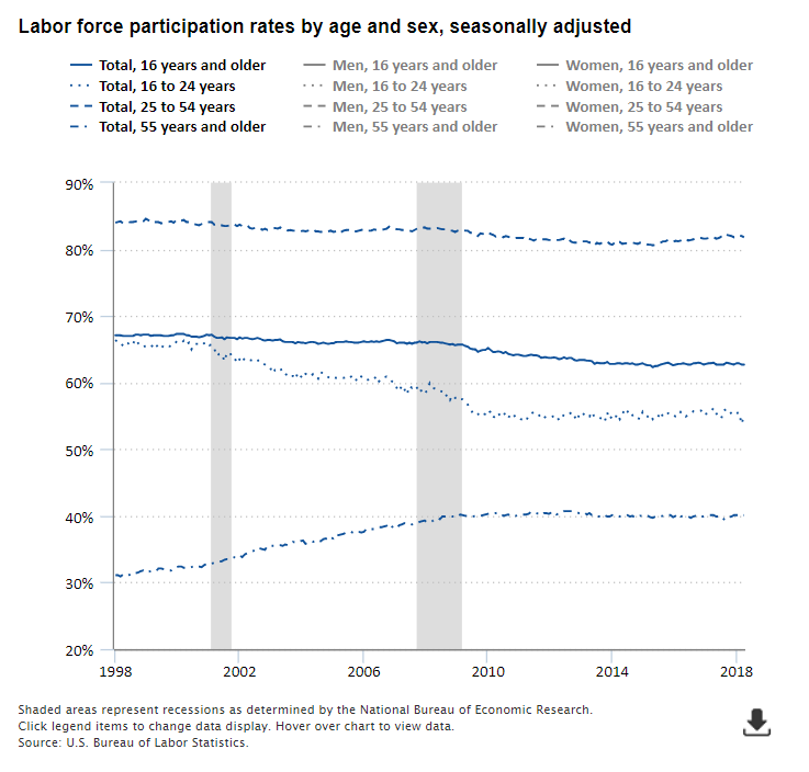
- Line charts do not necessarily have to start at zero. It all depends on the range of the values. For example, the civilian labor force participation rate has drifted downward since reaching a peak in the late 1990s and early 2000s. A chart showing the range of values from 62 percent to 68 percent shows the decline clearly. If the chart scale went from zero to 100 percent, the line would be flatter. That hides the variation and the interesting story and arguably misleads readers.
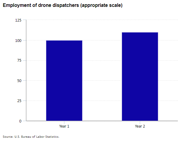
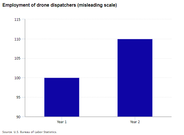
- For bar and column charts, the scale must always start at zero because the relative size of the bars is important for scaling. Starting at anything other than zero distorts the scaling. For example, see the charts below showing employment in the fictional occupation drone dispatchers. If there were 100 drone dispatchers employed in year 1 and 110 employed in year 2, the increase would be 10 percent. If the scale of a column chart began at 90 instead of zero, that would make the year 2 column (90 to 110) twice as tall as the year 1 column (90 to 100). That would mislead readers into thinking the increase was 100 percent instead of 10 percent.
- Most interactive graphics have a scale that adjusts automatically depending on the data values. For bar and column charts, the scale always begins at zero, and the maximum depends on the highest value. For line charts and other charts, the minimum and maximum vary with the data values shown.
- If you have a series of similar graphics in a publication, it is probably best for each graphic to use the same scaling.
- A short Quartz article elaborates on the topic of scaling.
Tooltips for interactive graphics
- Interactive graphics include tooltips=97pop-up text boxes that show data values when the reader hovers over the appropriate area of the chart. Tooltips can enhance data visualizations by providing readers with quick access to information about specific data points. The software BLS uses to create interactive graphics automatically creates the tooltips based on data displayed in the chart.
- As with other aspects of data visualizations, tooltips should be concise.
- Tooltips can display extra information not shown in the data visualization, but that extra information should relate directly to the data displayed in the visualization. For example, a map that shows the percent change in employment in each state over the year might have a tooltip that shows the percent change, the change in the employment level, the most recent employment level, and the employment level a year earlier.
- Tooltips generally should not include extra data that are not used to derive the measures shown in the data visualization. For example, a chart showing employment changes in large counties should not show wage levels in those counties if the wage levels are not shown in the chart.
Some Do's and Don'ts in data visualizations
Use sorting to help tell the story
- You might sort data differently in a chart than you would in a table. For example, BLS tables typically show industries based on the NAICS hierarchy. If you want to show readers which industries had the highest and lowest job growth, it would be more effective to sort the industries based on job growth.
Color choices matter
- Use colors that are easy to distinguish from one another.
- When choosing colors, be mindful of readers with color vision deficiency (CVD), commonly called color blindness. There are a number of good resources to help you use colors and patterns that readers with CVD can see well, including these from http://www.color-blindness.com/2007/06/02/how-to-color-= charts-respecting-color-blindness/ and Tableau.
- Consider using color in combination with texture in logical ways to help readers understand data groups. The JOLTS news release chart package has good examples of this technique.
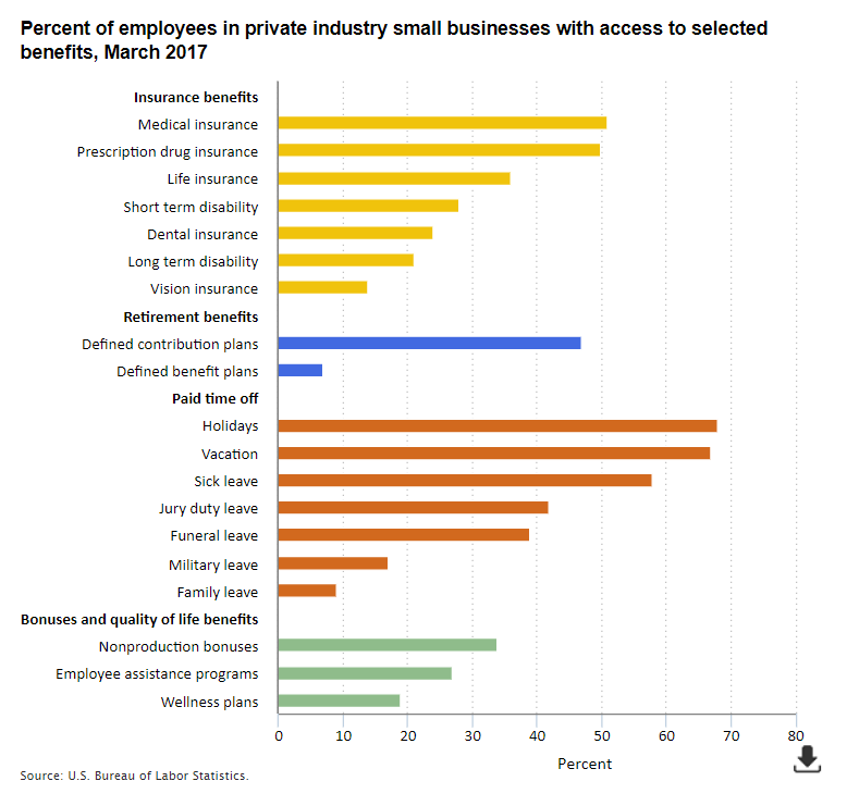
- Use color palettes that help readers understand logical groups. For example, in a chart showing different types of employee benefits, you might group insurance benefits with one color and use different colors for retirement benefits, paid time off, and bonuses.
- Use color palettes that help readers understand data ranges. For example, a map showing unemployment rates in each state may show all states in blue, with lighter blue for states with lower rates and darker blue for states with higher rates.
- Don't use colors that perpetuate stereotypes, such as a blue line showing men's earnings and a pink line showing women's earnings.
- Use the same color for a series that is included in other charts within the same publication.
Avoid clutter and wordiness
- If at first glance the reader can't tell what the story is, there's probably too much happening in the chart.
- Axis titles may not be necessary if the chart title is clear or other information from the axis makes it clear that the axis shows dollar amounts, percentages, dates, and so forth. If an axis title is needed, be brief.
- Series names in legends and labels can be challenging because of the sometimes wordy industry, occupation, and other titles we use at BLS. We need to be accurate about what a series represents, but if a title is too wordy, consider ways to shorten it to improve reader understanding. Avoid using abbreviations that may shorten a title but may confuse readers about the meaning.
- Notes should be brief and should provide information to help the reader understand how the interactive features work or what recession shading or other features mean. It is usually best to exclude detailed technical explanations about the data in a chart.
Limit the use of data labels in the chart area
- Remember it's a chart, not a table. Get rid of those data labels in the chart area. This tip is a corollary to the one above about avoiding clutter.
- All BLS charts and maps have a link to a table with the underlying data.
- This is an effective way to provide readers with specific data values without cluttering the chart with data labels.
- All visualizations must link to a properly formatted HTML table with the underlying data to comply with federal laws on making our data and services accessible to people with disabilities. Tables made using BLS table wizards meet this requirement.
- In interactive graphics, tooltips show data values when the reader hovers over the appropriate area of the chart.
Avoid redundancy
- If the time period in a line chart is clear from looking at the horizontal axis, the title doesn't need to state the time period.
- If the chart title says "Percent of workers who", the vertical axis doesn't need a title that says "Percent."
Don't make readers tilt their heads to read
- Slanted or vertical writing in axis titles or labels slows readers down and distracts them from focusing on the parts of the chart that are probably more important to the story you want to tell. If you have to slant axis labels and write axis titles vertically, it's a sign that your labels and titles are too wordy and you are trying to pack too much information into a limited space. Refer to the tips above about clutter, wordiness, and redundancy.
Don't use 3D.
- 3D features can often distort data and lead to wrong conclusions.
- The third dimension in a 3D graphic usually does not provide useful information. If it doesn't, it will confuse readers.
- Besides 3D, other unnecessary and possibly misleading features include beveling or shading effects in bars/columns.
Don't make readers do math.
- If you expect readers to make calculations in their head to understand the point of a chart, you probably should choose a different chart type or show different data.
Static versus Interactive and Animated Data Visualizations
Throughout our history, BLS has created static charts and maps to present data visually. We still publish static data visualizations, but our visualizations increasingly include interactive features.
Highcharts is the software we use at BLS to make interactive and animated visualizations that are compatible with our web publishing platform. The Office of Publications has created applications for creating visualizations using Highcharts, and anyone in BLS can use them. We start with a table wizard in which we can easily copy data from a spreadsheet to make an HTML table that is suitable for publishing. The table wizard links to the Chart Maker tool, which lets us create high quality interactive or animated visualizations in minutes. The Chart Maker tool provides many options for types of data visualizations and their features. The tool provides a template for making good data visualizations and helps us avoid common mistakes. Although the tool is designed for making interactive and animated visualizations, you can also use it to make high quality static visualizations.
Interactive features provide readers with more information than they can get from a static image. For example, see an interactive map showing state unemployment rates. When you hover over each state, more information pops up to show the state's unemployment rate in the most recent month, the rate a year earlier, and the change over the year. When you hover over the items in the map legend, the states in each category light up more brightly to help you see the states with similar unemployment rates.
Interactive features in charts and maps also give readers the power to choose what information they want to see. Here are some examples:
- A chart showing state employment lets readers choose in the legend whether to view the employment level, the 12-month percent change in employment, or the 12-month change in the employment level.
- A line chart showing job openings rates by industry over time includes 20 different industry groups. Our brains typically can interpret only 4 or 5 chart series at one time. The default view for this chart shows 4 industries and lets readers choose in the legend as many or as few industries as they want to view.
- A chart showing national unemployment rates over a 20-year period lets readers zoom in to see shorter time periods.
- A chart showing the 12-month change in the Consumer Price Index lets readers see major categories or drill down in a column such as food to see consumer price changes for more detailed food categories.
Animated features take interactivity one step further by helping readers see how measures change over time. The map we discussed above shows state unemployment rates for a single month. An animated version of that map shows how state unemployment rates changed each month over a 10-year period.
Interactive features and animation can enhance data visualizations, but we should avoid relying only on interactivity or animation to tell a data story. All charts and maps should provide readers with useful information as a static image. Interactivity or animation complements a good static image but does not substitute for it.
Where to get help
If you need help with any aspect of data visualizations, please contact the Division of New Media in the Office of Publications at newmedia@bls.gov.